
Albus (Mobile Banking App)
Role: UX Research, User Testing, UI Design Tools Used: Figma, Miro & FigJam Duration: 2 Weeks

Introduction
Seamless transactions and access to funds whenever needed are important to a lot of customers. In places like Nigeria or in most parts of Africa users find it hard to navigate through their favorite banking app due to its poor design, bad customer service, or network issues (a problem that is still plaguing the continent). All of these make for a poor user experience and this tends to make users go to their respective banks to make transactions which in itself is a hassle.
That is where Albus comes in. Albus is a microfinance app that aims to make the sending and receiving of money very easy and seamless. It is designed to give customers easy access to their funds and make transactions without any kind of problem. The main goal of the project is for transactions to be as easy as possible and to improve user experience.
The Challenge
I challenged myself to design a fintech app that would compete with other apps around since this is the future of tech in Nigeria and Africa at large. My aim was to design something that was easy to use and understand.
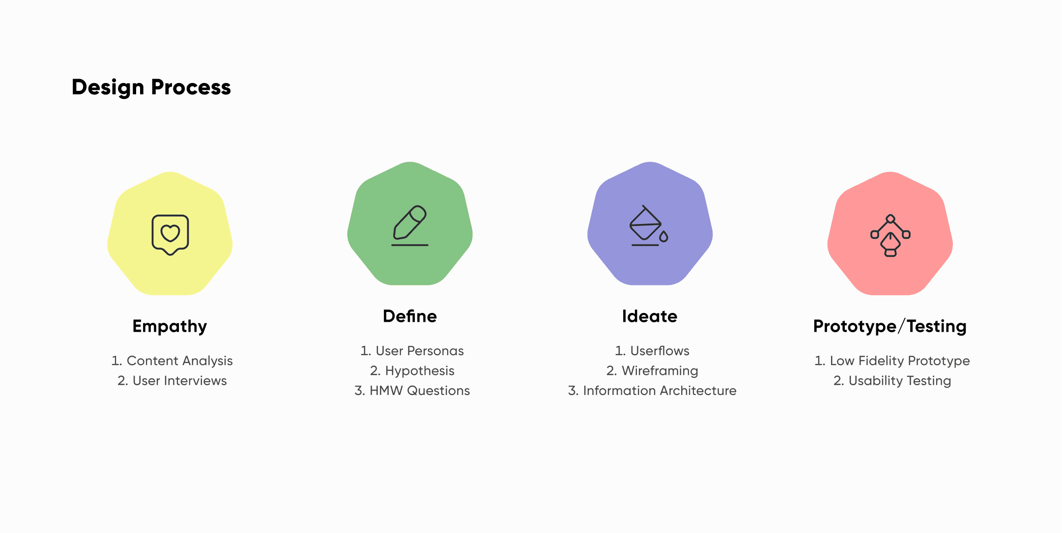
The Design Process
I got really good results by researching as deeply as I could before I sketched any screen or mockup designs. I followed the design process structure which helped me come up with the final design for the project.
Empathize
Define
Ideate
Design / Prototype
Test / User Feedback
Empathize
Competitive Analysis
The competitive analysis was used to understand what features our direct competitors had. This in turn will help inform the design that we will use later in the project.
I made a list of possible features and compared and then compared them with two different fintech or banking apps. They were the GTbank Mobile app and Kuda. Below is an image of the services that they had and how they compared with each other.
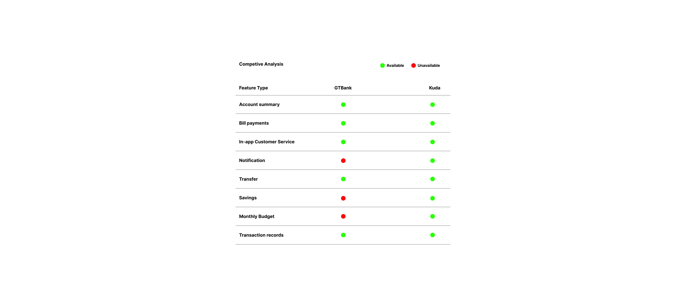
Through this identified the features that stood out the most for users when banking and these were:
Proper notifications
Savings
Monthly budget
Easy-to-use transaction system
User Interviews
The user interview was based on 8 questions and these in turn helped me understand what the users actually needed. It turned out to be an interesting and fun process. I wanted to know what went through a user’s mind when it came to sending and receiving money.
Some of the questions asked were:
What financial app do you use the most?
Tell me about your experience using your current financial app
What were your impressions of the onboarding (setting up) experience within the app?
How would you rate the usability of the app? Why?
Are you satisfied with the app overall?
What features do you use the most on the app?
What feature would you like to see added to your current app?
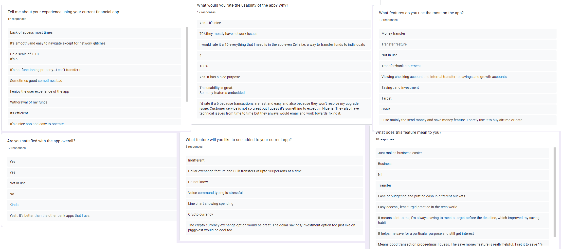
In total, I conducted 12 user interviews.
Some patterns appeared throughout the interview and they also helped me decide on some features and solutions that I was definitely going to add to the project. These were:
Half of the users had issues with the functionality of their banking app while the other half were somewhat satisfied with theirs.
Some of the users felt that the onboarding experience was very complicated and not too straightforward. Some found theirs to be very simple and efficient.
The usability scale per percentage by the users was rated from 40 to 100% but most of them were not fully satisfied with their banking apps overall.
The users loved the fact that they were able to make transfers, buy airtime, set financial goals, and save with their banking apps. They felt that it helped them run their businesses better, gain interest while saving, and finally improve their saving habits.
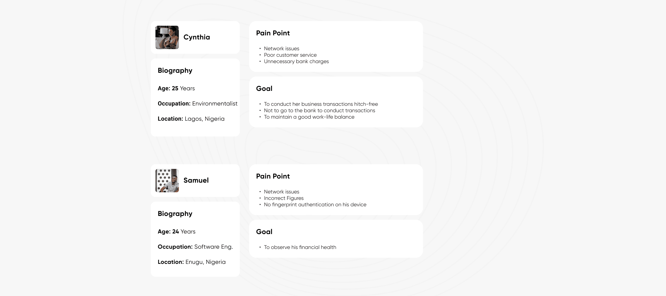
Define
I came up with two user personas which helped me further define the project goals
Hypotheses
The hypotheses were based on three of the most frequent answers from our user interview. These responses were:
It is a good but complicated app.
When I need to access the app, I can’t because it's complicated.
Network issues.
A lot of banks and fintechs in Africa spend millions to improve their apps but there are still some users that find them hard to use. A better onboarding experience might be the solution here.
How Might We
These questions were created based on the personal interpretation of the users during the interview process.
How might we make transactions easy?
How might we represent transactions better?
How might we make it easy for users to access their cards?
How might we improve the onboarding experience?
Ideate
Information Architecture
The Information architecture was created on FigJam which was a super helpful tool. It helped me organize every bit of the app feature and improve overall ease of use.
User flow
This user flow best represents how the app functions and what I want to design. It was based on extensive research made from the competitive analysis. This will provide the framework needed for the wireframe sketches later in the project.
Wireframing
Lo-Fi & Hi-Fi Wireframes
I had a lot of ideas for the app’s design but eventually, I chose to move forward with the design in the Hi-Fi wireframe which I shared below.
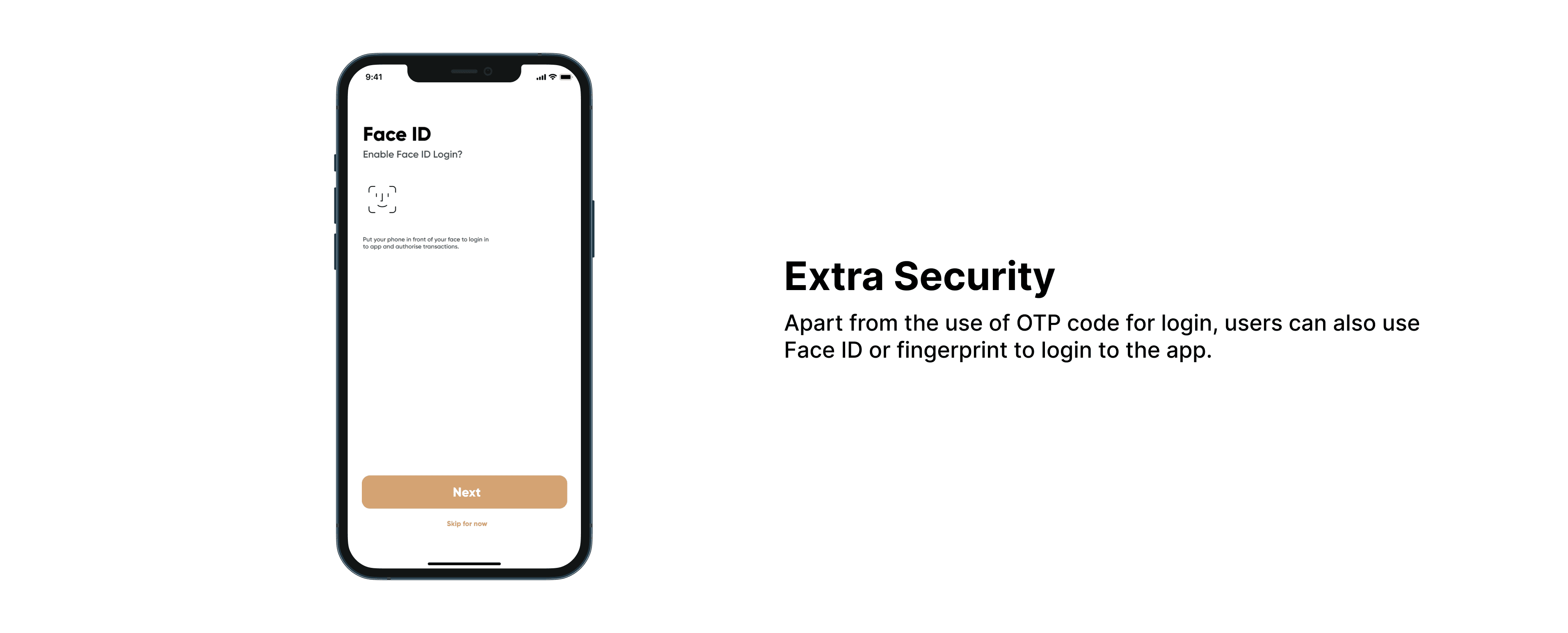
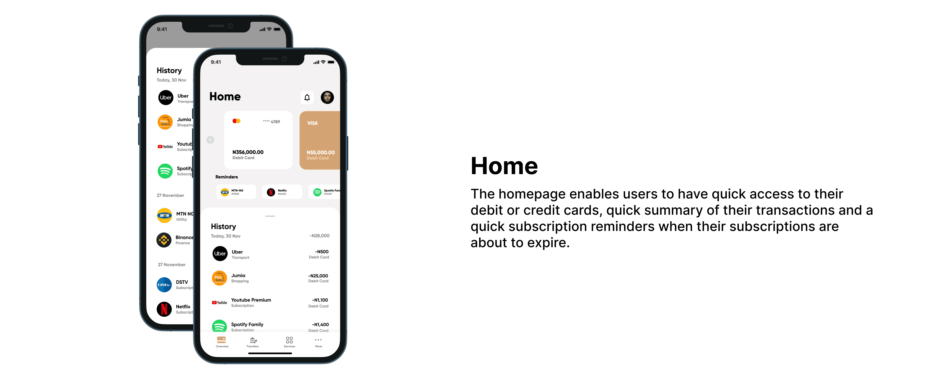
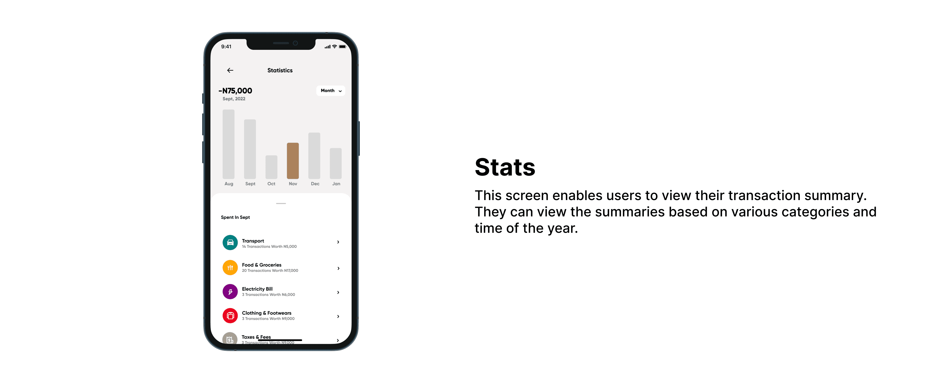
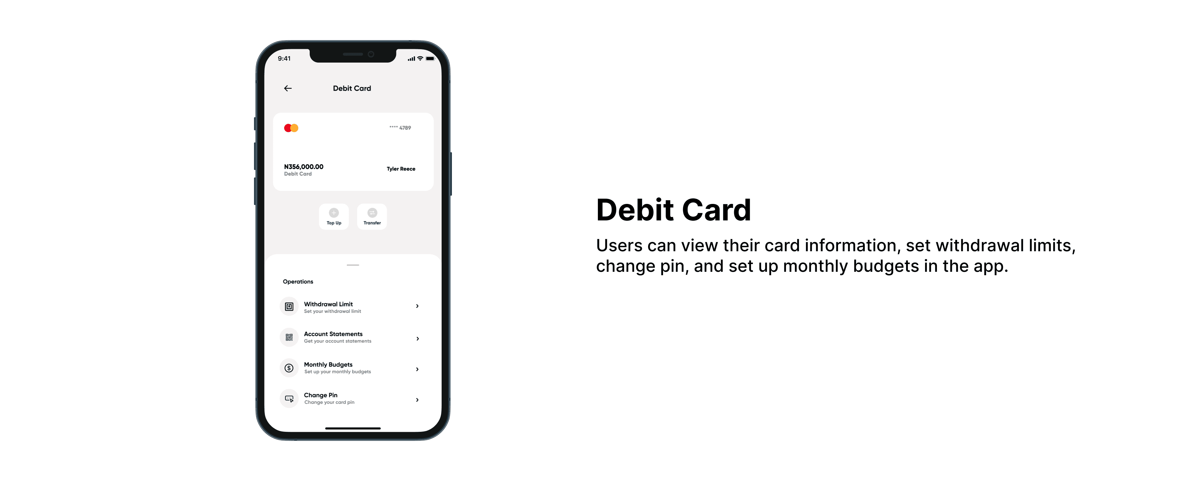
I wanted to make the app design very easy and straightforward so that users can easily navigate through it and complete whatever action they want to complete. Throughout the platform, card accessibility and ease of making transactions were emphasized. I made it possible through the little reminder chips which suggested to users certain actions based on their usage of the app.
First Usability Test
Before designing the main app, I conducted a usability test as I always do with all my projects with users to see if I could make a change or improvements to it. The users that I showed the project to were somewhat satisfied with the approach that I took, they were especially excited with the reminder chips that suggested certain actions to them based on their usage. They hoped that they would see that feature in real-world usage.
Design
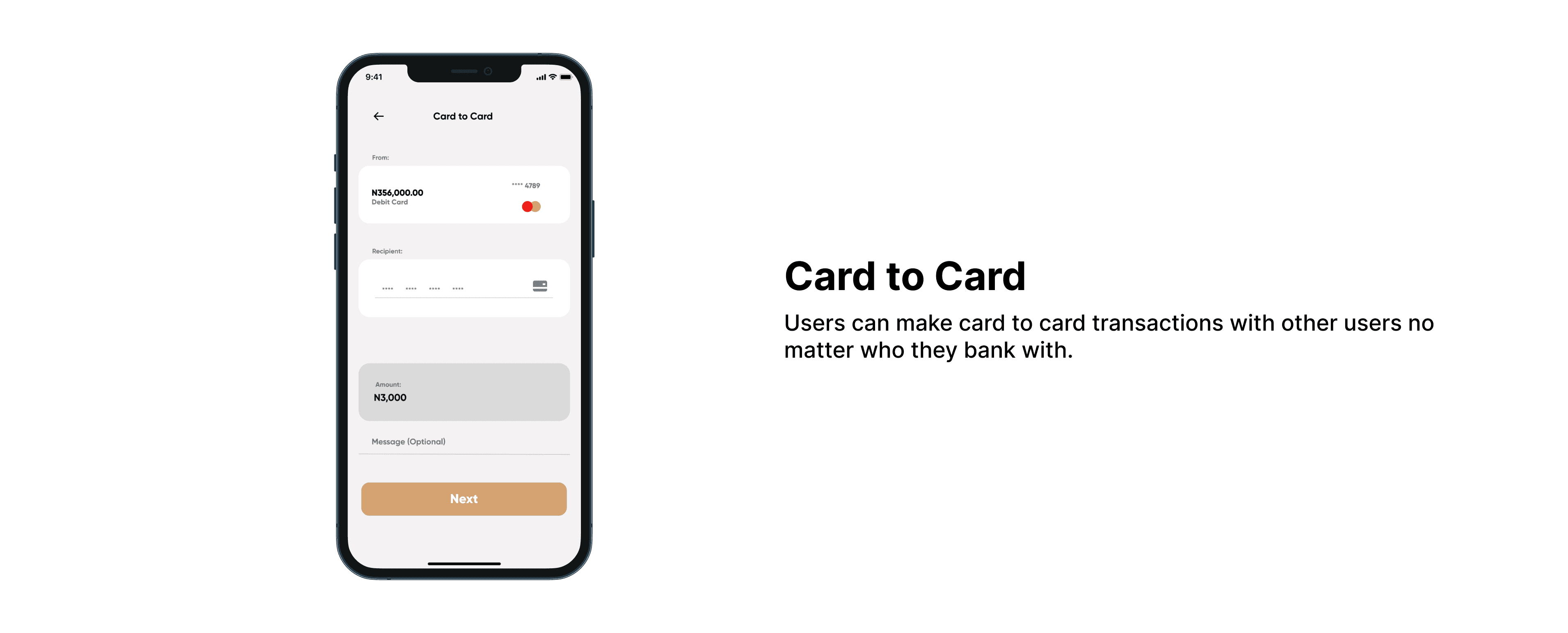
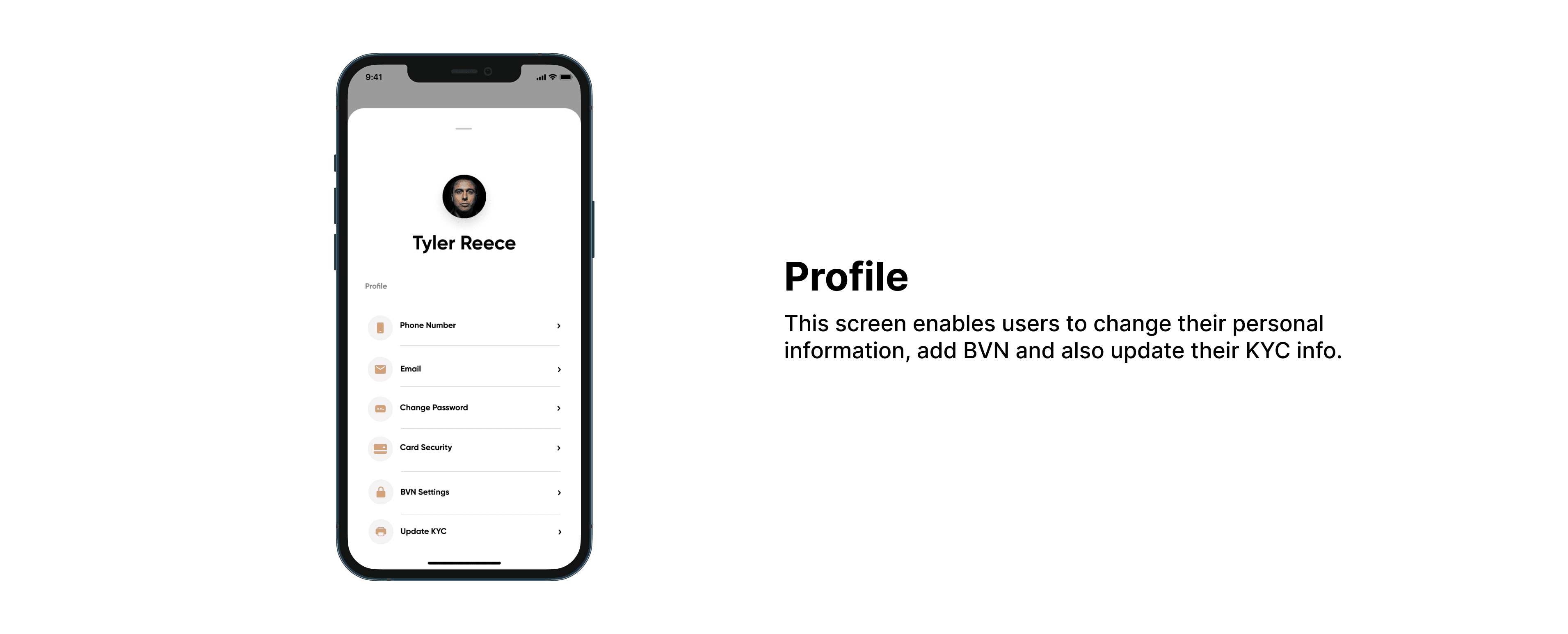
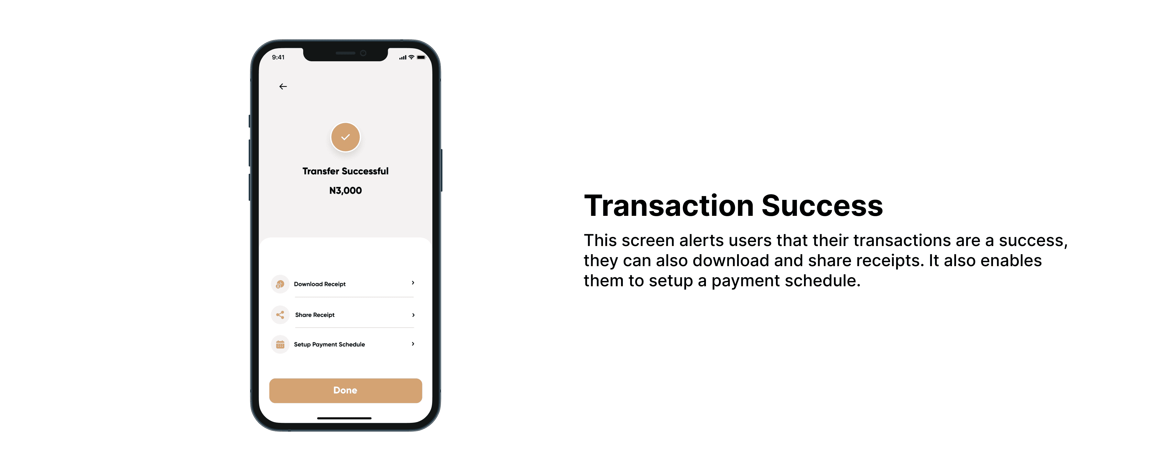
These are the final designs that I came up with


Second Usability Test
I conducted another usability test to see how users would respond to the project and at the end of the test, the users still maintained that the banking app was quite easy to use and that they hoped it would be fully developed for real-world usage.
How Did Users Respond?
Generally, the users loved the concept and gave me positive feedback. The suggestions chip was definitely their favorite part of the project.
Reflection
Designing this project helped me realize how challenging and competitive the African fintech space is. Learning through user interviews and feedback, I understood that each individual had different pain points and it is our job as UX designers to work on every one of those pain points.